This is a guest post written by Phil Vander Broek - Co-founder of Dopt and ex-Head of Growth Design at Dropbox - with my added commentary throughout.
It’s your comprehensive guide to onboarding for all product-led companies.
This post is presented by Sprig - build a product people love.
Sprig is an AI-powered platform that enables you to collect relevant product experience insights from the right users, so you can make product decisions quickly and confidently. Next-gen product teams like Figma and Notion rely on Sprig to build the user-centric products people love.
At Snyk, Sprig was an indispensable part of our product stack, and now, readers of The Product-Led Geek can get 10% off!
Build products people buy. Understand user behavior, boost retention, and scale your digital product with Amplitude for Startups. Apply for discounted access to the Amplitude Growth Plan or discover the right program for you.
Amplitude has been an indispensable tool throughout my product & growth career and now startups can get a whole year completely free!
Building great self-serve product-led onboarding is hard. What is good onboarding? What patterns (templates, checklist, tips) should you use and why? How should success be defined? Since every product offers unique value, it's hard to know what will work for your product.
And yet, onboarding is one of the most important parts of the user journey. It's often the biggest driver of user activation and retention, the key driving metrics for any product-led business.
Most product onboarding content is clickbait ("Top 10 onboarding tools") or lacks context ("How to build a good tooltip tour").
This guide is different.
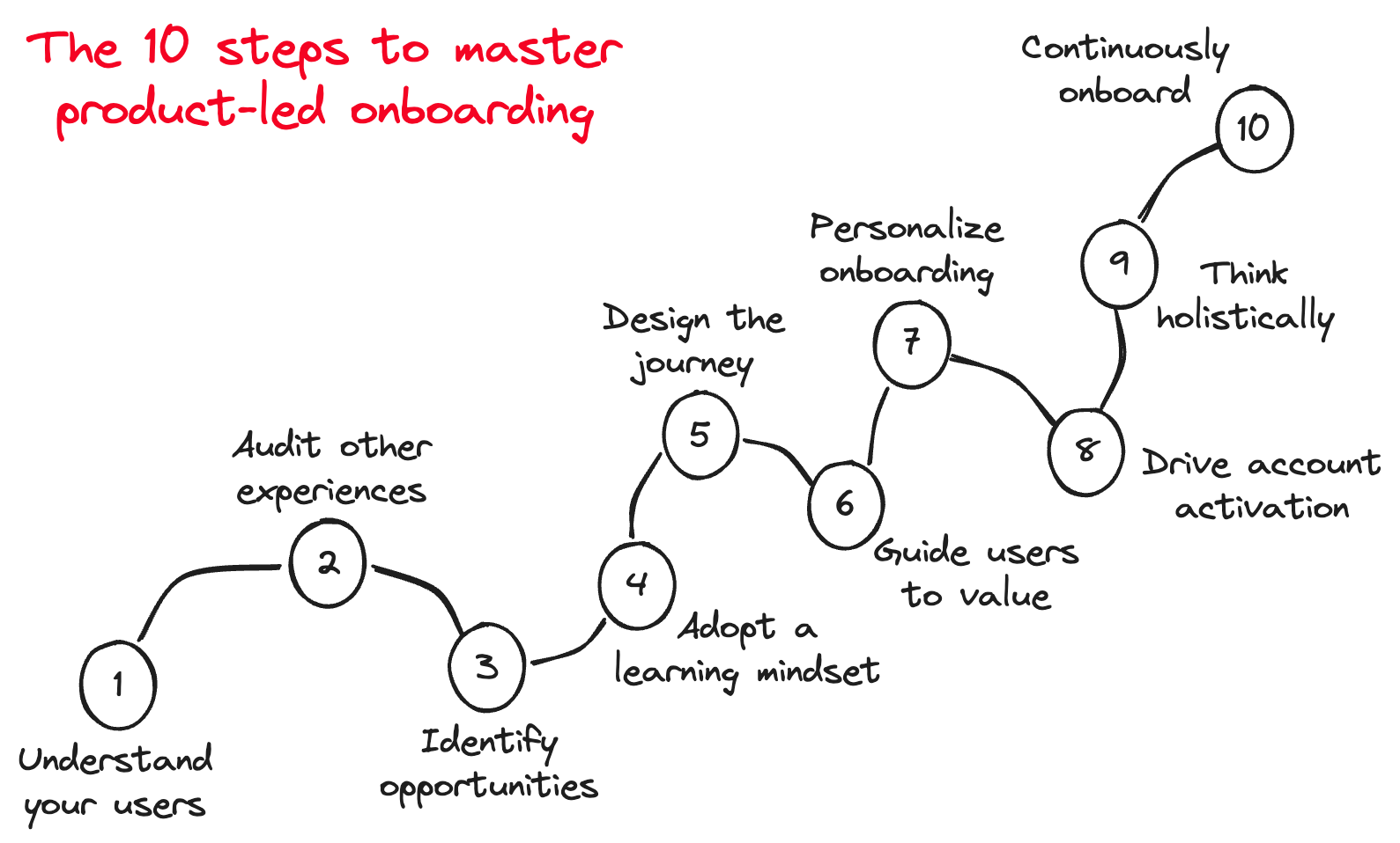
It's a playbook - designed to be comprehensive and actionable. It starts from first principles and offers patterns and best practices. It's not boilerplate — the 10 steps should help you nail product onboarding for your unique users and product.
In addition to Phil’s experience as Head of Growth Design at Dropbox and working with Dopt customers, alongside commentary and additional tips from myself, the guide contains incredible insights from Lauryn Isford (Head of Product Growth at Notion), Gaurav Vohra (Head of Growth at Superhuman), Janie Lee (Head of Product at Loom), and Kate Syuma (ex-Head of Growth Design at Miro). A huge thanks to them!
1. Understand your users
The job of your product's onboarding is to connect users with the value that's relevant to them. To do this, you must understand your users.
There are two key questions you'll need to answer:
What types of users need your product enough that they would pay for it? These are users within your Ideal Customer Profile (ICP).
What do they really care about? Their jobs-to-done or use cases, basically what they're trying to accomplish by using your product, and pain points, areas where your product could be especially valuable or differentiated.
Ben: In B2B it’s not sufficient to just consider individual users. They are working within their teams, and you also need to deeply understand that context. What are the pains, problems and challenges of those teams?
And keep a narrow focus with your ICP. It’s tempting to cast a wider net, but it’s almost always a bad decision that leads to poor focus and a mediocre experience. You don’t want to become a jack of all trades and a master of none.
It’s essential that you are regularly talking with users - you have to go beyond quantitative data. If you own the onboarding experience, you need to be doing this work. Don't outsource it.
Lauryn Isford - Head of Product Growth at Notion
You can do all of the data analysis possible to understand what are the drop-offs and friction points in your onboarding, but only conversing directly with customers will help you understand why and arrive at the right solution.
You can kickstart this by going out of your way to hand-onboard 5 to 10 users. Use those sessions as:
open-ended opportunities to learn more about your users and validate any job-to-be-done and pain point hypotheses
selling your users on the product to understand their perception of value and, in doing so, figuring out what might be most effective when it comes to onboarding your users
Gaurav Vohra - Head of Growth at Superhuman
Superhuman started out hand-onboarding customers to get rich insight into their deepest pain points, jobs to be done, and aspirations with email — all while brand-building and driving deeper engagement. During each onboarding, we captured key bugs, feature requests, and notes for what we'd eventually turn into our self-serve product onboarding
Another great source of insight is your go-to-market teams. They'll have a sharp idea of the value your users really care about, what converting users via sales looks like that you might automate, and insights into the overall user journey.
Thanks for reading The Product-Led Geek! Subscribe for free to receive new posts and support my work.
2. Audit other onboarding experiences
Looking at how others onboard their users and teams can help you learn what good looks like and generate compelling solutions.
Ben: The aim is not to copy-paste what you see in other products, but to drive conversation in your team about why certain approaches might work in a given context, and to take inspiration from that as you consider your own onboarding.
I recommend auditing onboarding for three types of products:
Direct competitors and products in the same category
Products in adjacent categories targeted at the same type of user and team
Best-of-breed products that are known for quality onboarding
You don’t need to be exhaustive — focus on answering these key questions:
How does the experience accelerate time to value and reduce friction? Common patterns are: templates, demo mode, pre-loaded data, etc
How directive is the onboarding? Is the onboarding opt-in or required for all?
Is the experience tailored to different types of users and teams? Tailoring is often based on the use case or role answered during setup.
What UI patterns did they use? Checklist, interactive tutorials, embedded tips, etc. A common pitfall is to only focus on auditing patterns. By answering the other questions first, you'll answer why the UI patterns do or don't work.
Janie Lee - Head of Product at Loom
The cross-functional Growth team gets together regularly to do audits and teardowns. This is one of our favorite team rituals! We like to choose a theme, give the team time to take screenshots and add notes about what they did / didn't like, and have live time to discuss our takeaways. Some discussion topics turn into actionable items in our Eng team's backlog!
Mobbin and Pageflows offer product and onboarding audits and will save you countless hours (they're paid products).
3. Identify friction and opportunities
Tear down your own product's onboarding by creating a visual map of the flow. To do this
Sign up for your own product and map all steps for your users to onboard. Consider breaking this down by persona or jobs-to-be-done.
Include pain points, missed opportunities, and moments of delight.
Use session recording to quickly understand the most common journeys and pain points. There's nothing like seeing a user fail in real time to build empathy!
Layer in quantitative data for a complete picture. Use product analytics to determine where the biggest drop-offs are.
Ben: I’m a huge fan of creating friction logs for your onboarding experience. They offer a valuable structured commentary of the end-to-end flow that makes it easy to identify opportunities for improvement. Here’s an example of a friction log I created when i joined Snyk.
Pro tip: getting new team members to create a friction log for your product as part of their own team onboarding is a great way for them to get familiar with your experience, and offers you a fresh-eyes perspective on the new user journey.
Kate Syuma - ex-Head of Growth Design at Miro
Many products have way more than just one onboarding journey. It's essential to regularly do reviews across different personas and use cases. You'll uncover situations when some segments see absolutely irrelevant content after the sign-up page.
Pro tip: check the second session in the product — usually a lot of unexpected notifications can pass there as leftovers of the first session.
The key to layering in quantified funnel analysis is to focus on where you see churn that is causal with activation and retention. What were the challenging moments that caused a user to give up? How can you make those moments delightful?
You won't get your onboarding right the first time. But that's okay. The path to high-performing onboarding experiences is to design your initiative around learning.
A common trap I've seen is for good research to balloon scope (let's build what Airtable built!). Don't fall into that trap! Let the research inform a north star design and an iterative path to getting there.
Gaurav Vohra - Head of Growth at Superhuman
As a product leader working on your customer funnel, at least 25% of your focus should be on shipping with high velocity. A good rule of thumb is shipping improvements weekly. Compounding learnings from shipping fast and learning creates a positive feedback loop for your team and ultimately your customers!
At Dropbox, our Growth team would often organize around a north star with 3 evolving iterative product milestones. Each milestone had a hypothesis, a learning goal, and a success metric. The first milestone is the most important because it should be the minimum amount needed to test if the overall north star hypothesis is valid. We would take the learnings from milestone 1 as input to future milestones or stop the work.
The key is to prioritize getting something live to users fast. Smaller iterations with compounding learnings will result in higher-quality onboarding.
Ben: For the fellow geeks here’s a quantitative explanation for why you should prioritise learning:
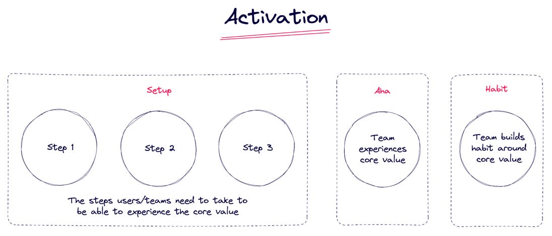
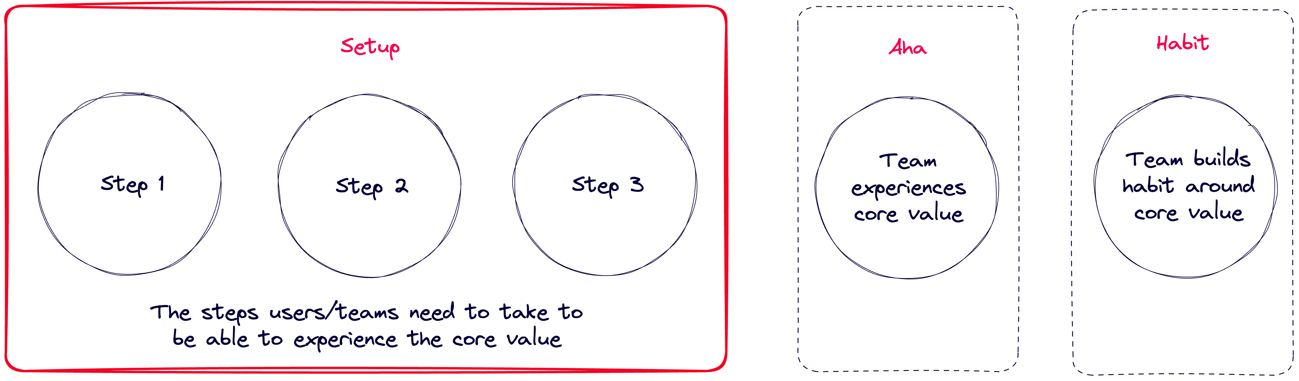
Armed with the research you've done, you'll now want to look towards the future by designing the ideal end-to-end onboarding journey.
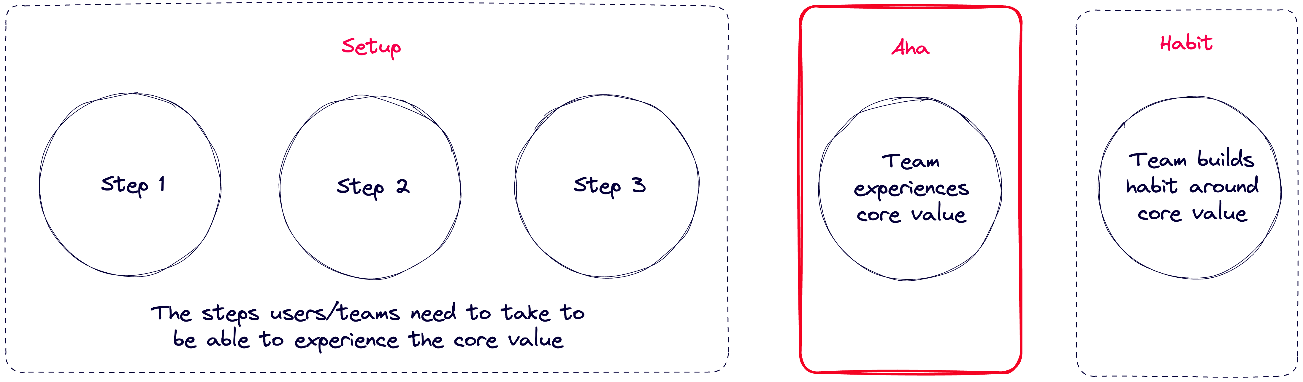
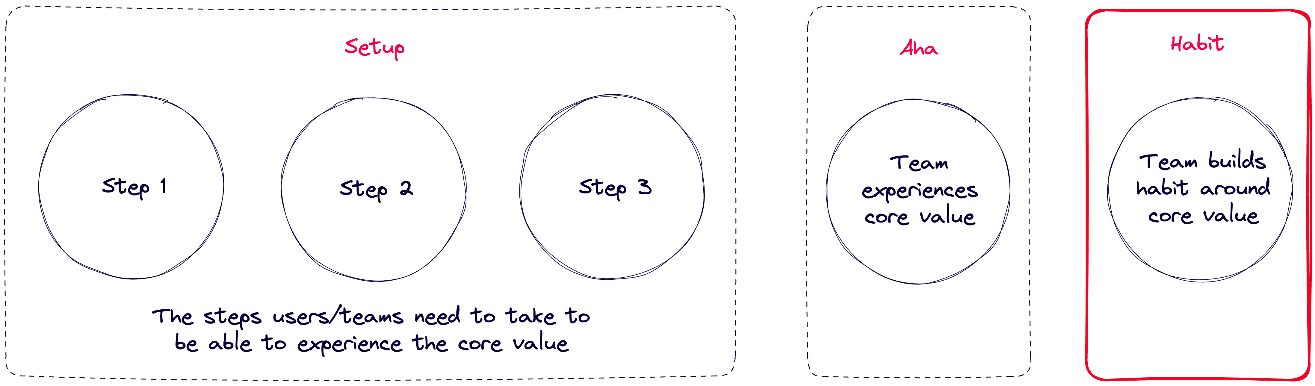
To start, define the most important moments of their journey: Setup, Aha moment, and Habit.
Ben: What you’re trying to do here is overlay onboarding to your activation journey, and understand the key moments of the journey that your onboarding can shepherd users and teams toward.
Setup is the steps your users or their teams need to take in order to get to the point where they can experience the core value of your product.
The aha moment is when they first experience that core value.
The habit moment is when they build a habit around the core value.
Setup moment
To determine your setup moment, figure out what the necessary steps for a user to go through in order to reach the aha moment. Don't fall into the trap of having them set up everything your product supports — only what's necessary. Consider progressive disclosure, especially if the product is particularly deep or requires a lot of exploration.
Common setup steps include:
Naming and configuring the workspace
Answering profiling questions (also gives you an opportunity to learn and use the answers to tailor the downstream onboarding and product experience)
Downloading an app, setting up integrations, or installing a browser plug-in
Inviting teammates
Lauryn Isford - Head of Product Growth at Notion
Learning how to use a new product is exhausting!! Set your users up for success by ensuring that setup is an exchange of value — every time they work hard to give you information or to onboard to your product, reflect that hard work immediately back to them with relevant, personalized, or magical experiences.
Miro asks users a series of questions to better understand them. Bonus! They say they'll provide better experiences based on the answers.
Ben: Contrary to popular belief, not all onboarding friction is bad, and asking the right profiling questions can give you valuable data to help tailor the user experience and input to your product-led sales engine. All while not harming (and in some cases) improving your activation rate. Elena Verna shared a great LinkedIn post about the benefits of asking profiling questions during setup.
Aha moment
The aha moment is one of the most important moments of your onboarding, so spend some time making sure you really understand this for your users and that it maps to the jobs-to-be-done you established earlier. The aha is critical because it’s often beneficial to try reducing the time to aha moment as much as possible.
Janie Lee - Head of Product at Loom
Loom's aha moment is when a creator gets their first view. It's indicative of the creator closing a full feedback loop — not only have they conquered any psychological and cognitive barriers to recording a Loom, but they've also reaped the benefits of recording (supercharged their productivity or canceled a synchronous meeting).
The best way to determine your aha moment:
Start with a simple hypothesis by answering: what's the first moment a user realizes the value of your product for their job-to-be-done? Then see if it correlates with mid-to-long term retention or paid conversion.
Once you know you have a product that customers are using and coming back to at an expected rate (this might take a while!), run a series of experiments to prove causality between your activation metric and retention.
It's easy to get lost, so keep it simple and focus on shipping to learn.
Gaurav Vohra - Head of Growth at Superhuman
Superhuman's a-ha moment is when a user has taken 50 'clearing actions'. A clearing action is when a user does one of the following to an email: mark done, snooze, trash, move to folder, mark spam, unsubscribe. 50 is low enough that it can happen in the first few days and high enough that users cannot accidentally reach it. A user who meets this condition fundamentally "gets" the Superhuman email workflow and inbox zero, and is significantly more likely to retain.
Note that trying to determine an activation metric using quant data too early can be a distraction, especially if you're a start-up or building your first onboarding experience.
The habit moment is the milestone that is demonstrative of a user or team building a habit around the use of your product. It will correlate with mid-long term retention even more strongly than the aha moment.
Ben: Sometimes, but not always, the habit moment might be repeated aha moment events.
To determine your habit moment, consider actions that a user or team repeatedly takes, and look at how predictive those things are of downstream retention and propensity to buy.
Try to answer how many times and how often a user or team should be performing those actions to become healthy and retained. A few examples:
For an analytics tool, this could be creating 4 charts in the first 14 days.
For an email tool, this could be triaging 20 emails in the first 7 days.
For a spreadsheet tool, this could be collaborating with 3 or more users on 2 or more sheets in the first 30 days.
Tying this back to onboarding, you'll want to design an onboarding experience that guides users toward a pattern of retained usage after they experience the aha.
Gauarv Vohra - Head of Growth at Superhuman
Superhuman's primary habit loop is clearing actions and a feeling of progress towards inbox zero. A user's first habit loop is to get used to clearing emails. Their second (stronger) habit loop is to regularly hit inbox zero — ideally at least once weekly. We have strong rewards built into the product for hitting inbox zero and are currently building loop reinforcement around clearing actions.
More reading:
Ben: See below for a deep dive on how we defined activation at Snyk using this framework.
Don't expect a user will just know how to use your product or why it's valuable. Plan on creating an onboarding experience that guides the user to value that's relevant to them.
Ben: Remember, in B2B, ‘relevant’ should factor in the user’s role in the team and the context of what the team’s goals are.
The work you did understanding your users, auditing other products, and identifying points of friction should arm you with hypotheses for an effective onboarding experience.
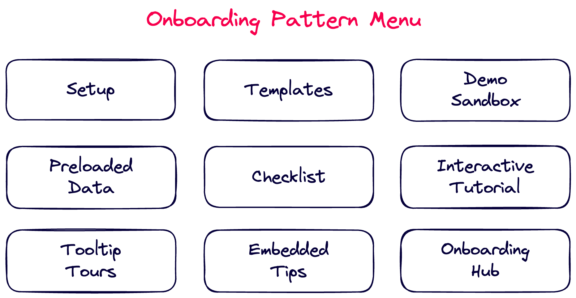
Below are some of the most common onboarding patterns and when you might consider using them. These aren't mutually exclusive; you can mix and match.
Essential setup
Notion asks users how they plan to use the product.
Essential setup is the initial getting started experience, often a wizard, that guides users through to their setup moment.
Great for
Most products require some amount of setup.
Why they work
They're highly directive, which gives you the opportunity to strongly guide users to the most important and required actions. As a best practice, if a step is not required, it's recommended to let users skip it.
Drawbacks
Many setup experiences include non-essential steps, which can add unnecessary friction. As stated earlier, only include what's necessary and use progressive disclosure for the rest of the journey.
Lauryn Isford - Head of Product Growth at Notion
This is the moment to get the information needed to reflect value and personalization back. It's important to keep it short and sweet.
Notable examples: Notion, Dropbox, Loom, Attio, Linear
Templates
Miro uses templates categorized by use case to help users get started with boards that are relevant to them
Templates give users the option to start with a pre-built solution to a relevant use case.
Great for
Horizontal apps that are used for different vertical use cases, like collaboration apps and developer platforms.
Why they work
Reduce friction by skipping empty states and long creation experiences
Are opt-in, so the user is in control to use them or start from scratch (or both)
Provide fast and relevant value to a use case the user selected
Promote learning the product by using the product
Drawbacks
Templates often get users from 0 → .5, so the user will likely still need more guidance to get to the aha moment
Pro tip: if you ask users what they're trying to accomplish during setup, an easy win is to present the user with templates for those use cases.
Mixpanel has a demo sandbox with an introduction and 5 fully set up analysis boards
A demo sandbox is a separate mode or workspace that demos what the product looks like when it's completely set up.
Great for
Products with long or complex onboarding, especially B2B or enterprise products. For example, an infrastructure monitoring product may need integrations and time to monitor the data to demonstrate value, which has loads of friction.
Why they work
Speeds up time to value by manufacturing an aha moment that's hard to get to, building user motivation
Promote learning the product by using the product, showing value rather than telling users about it
Drawbacks
The aha moment is manufactured, so it doesn't help the user progress down their actual onboarding journey.
Notable examples: Mixpanel, Stripe, Vercel, New Relic
Preloaded data
Linear starts users with preloaded issues that act as a checklist but are completely within the product
Many products start with data preloaded in their product. For example, Linear starts you with a few issues.
Great for
Products with well-known interaction models and workflows.
Why they work
Speeds up time to value by solving the cold start problem
If used creatively, the preloaded data act as the next best steps, similar to a checklist, but native to the interaction model
Promote learning the product by using the product
Drawbacks
The user didn't create the data, so they may still need help learning how to get started creating for themselves, especially if the interaction model is complex
The users may have to delete the data if it's not relevant so it doesn't pollute the workspace
Users can't opt out
Janie Lee - Head of Product at Loom
We pre-populated new users' libraries with Looms recorded by people who had the same functional background (e.g. marketing) as them. This not only gave exploratory users a way to experience what viewing a Loom was like but also served as onboarding content that taught role-specific use cases.
Notable examples: Linear, Superhuman, Front, Hex
Checklists
Superhuman uses a checklist to onboard users.
Checklists give users a series of steps to guide them toward the aha moment and other important actions. A best practice is to keep checklists action-oriented and optional or dismissible.
Great for
Products that have complex activation journeys, like dev tools, or have many actions to get to the aha moment, like products with browser plug-ins or desktop or mobile apps.
Why they work
Provide a structure to the onboarding journey in one central place. It's easy to know the next best step or come back later
Help the user feel like they're progressing towards achievement with progress bars
Checklists can be tracked at the workspace level, acting as a joint action plan for a workspace.
Drawbacks
Checklists provide high-level structure, so by definition, they're not contextual, so they can be distracting or there may be alternatives that are more native to the product.
Gaurav Vohra - Head of Growth at Superhuman
A checklist is an extremely simple way to help users take crucial 'set up' steps, such as opting into settings and getting your app on another device. Rewarding users early with visual progress helps create early wins. Meanwhile, having users invest in setup creates a small endowment effect. Both contribute to users being more likely to keep using your app early on in their journey.
Janie Lee - Head of Product at Loom
Loom uses an onboarding checklist to get encourage users along the journey to their aha moment. There were a few things top of mind as we built this:
Ensure every item in the checklist had a clickable CTA to make it as easy as possible for the user to act
Offer use cases or education on steps that seem heavier or more complex
Include moments of visual delight (i.e. fun animations and progress bar) to celebrate users' accomplishments
Retool has an interactive tutorial that helps the user take action to create their first internal app. It's entirely scripted but in their core builder experience.
An interactive tutorial is a scripted, interactive guide through a product. The experience is in a sandbox and often incorporates user actions to complete key steps. The most well-known example is Slack's onboarding, where the guide prompts you to actually send a message.
This pattern is borrowed from games like Cut the Rope, where the user learns how to cut the rope by performing an action — cutting the rope! And then continues to slightly more complex concepts leading to the aha moment.
Great for
Products that have a single, core end-to-end workflow to get to the aha, especially if the interaction model is novel (like when Superhuman first popularized ⌘K).
Why they work
The script and interactiveness let you own the story without feeling like a boring tour
Since it's scripted, you can choose the pacing, like starting simple and building to fake complex workflows, like receiving a customer support message to kick off a new workflow
The user learns by doing (usually in a sandbox environment)
Drawbacks
Since they're scripted, they're not tailored, so they're best for core workflows that are relevant to all or most users
Ben: Webflow does this incredibly well too, masking the complexity of the UI by focusing on key concepts and elements.
Tooltip tours
Figma has a simple opt-in tour experience during onboarding.
The most polarizing pattern, everyone loves to hate tooltip tours. And for good reason! They're usually long and distracting. But (and hear me out) tooltip tours aren't inherently bad; they're just misused.
The best tours are 1 to 3 steps. They have a starting tip that explains the value of the feature and should be able to stand alone. If there are more steps, they should be opt-in. Keep them action-oriented, where the user performs an action rather than enumerating features. An 8-step tour that points out UI elements one after another will not work well.
Great for
Very flexible and works for most types of products
Why they work
Call the next best step for a user contextually
They're simple and can be easily adapted since they're overlaid
Drawbacks
Since they're overlaid, they don't feel natively integrated into the product or interaction model
Often distracting, spammy, and too long
Often point out UI rather than being action or value-oriented
Lauryn Isford - Head of Product Growth at Notion
Tooltips are actually pretty hard to learn from! They're a fast, transient series of information tidbits that you have to memorize — that's a lot to ask of a new user.
An onboarding hub is a centralized place in your app where the user can return for onboarding and help. This is often a mix of the patterns above and could include a checklist, embedded tips, and entry points to interactive tours, documentation, and support. The onboarding hub typically has a permanent place in the navigation until dismissed or completed.
Great for
Products where the user needs more content, support, and documentation to reach their aha moment, such as developer tools, financial tools, and some collaborative apps and marketing tools.
Why they work
Since the most important resources are centralized, the user knows where to go for the next steps or if they get stuck.
The pattern gives you the flexibility to create the experience, content, and entry points that are best for your users and product
Drawbacks
Since the hub is its own space, it isn't contextual to the user's flow in the product (but it could provide entry points to contextual experiences)
Notable examples: June, Framer, Hubspot, Retool
Ben: All of these approaches should be considered a menu. Ask yourself which of these mechanisms is going to best support the user and their team in progressing through their onboarding and eventually building a habit around the product. The answer will be different for every product.
Pro tip: avoid empty states in your product. New users should never feel like they’ve hit a dead end. Instead use that real estate to guide the user toward the next-best action that you want them to take.
7. Personalize your onboarding
Ben: Not all users are created equal. Context is everything.
After you nail your new user onboarding, the most effective way to level it up is to tailor your onboarding experience to the different types of users. The most common types of tailoring are based on:
A user's jobs-to-done.
If the user was invited to a workspace (rather than the first user). This gives you an opportunity to skip setup steps that are already completed or help the user ramp on content that's already created in the product.
The plan the user signed up for or upgraded to (free, pro, enterprise, etc.). Each plan offers different values you can connect users with.
Kate Syuma - ex-Head of Growth Design at Miro
Collecting the right information about your users from the early days of the product will serve you in the long run — roles, experience, goals, etc. become a great foundation for personalization.
Ben: At Snyk we bifurcated the onboarding experiences of the first user in a workspace and the n’th user. This was in acknowledgement and support of the multiplayer nature of developer security. See the next section on account activation for more on this important concept.
For B2B products, your ultimate goal is to activate and sell to the account. Activating an individual user is never enough.
Ben: In B2B SaaS, you’ll almost always want your activation, engagement and retention metrics to be team-based, not individual user-based.
You’ll still drive behaviour at the end user level, but you’re trying to influence aggregate-level behaviour across a team and company, as that’s what you’ll ultimately be monetising.
Consider account-level milestones, like setting up an integration or billing, as important moments in the journey.
Inviting collaborators enables expansion, so design when this should happen during onboarding. For some collaborative products it should be a step during essential setup because it's so important for a user to get value out of those products.
When a user with a domain that already has a workspace, help them discover the workspace by matching domains.
Ben: The below slide is from the new Reforge PLG course, designed by Elena Verna and Kelly Watkins. I was part of the program council supporting content development and am appearing again as a featured guest in the Spring cohort starting in March 2024.
The slide describes how in B2B, you need to design an end-to-end monetisation journey (escalator) that starts with the end user but eventually realises the goal of company-wide monetisation.
9. Think holistically
Look upstream to the website
As the first touch in the user journey, your website sets the stage for the entire user journey, answering key questions: What is your product? What problem does it solve? Why is it better than alternatives?
Your website shapes your user's intent as they start the onboarding, so clarity matters. Focus on creating simple and clear copy, product-oriented imagery, and clear CTAs.
You're teeing up a value promise and building momentum — it's on your onboarding to deliver on that promise. If your user enters your product looking for the wrong thing, then your onboarding will fail from the get-go.
Combine your product-led onboarding with support and sales to power a cohesive journey. Some users will get stuck and some users will want personalized hand-holding. For example, a developer will rarely want to talk with a person while an admin or buyer is much more likely.
A few ways to fold these motions in:
Contextual entry points for users to self-serve help and documentation, similar to contextual and embedded onboarding
A way for users to raise their hand for help or a sales conversation, like a "book time with us" link, Slack or Discord user community, or chat support.
A way for users to give you feedback in-app.
Janie Lee - Head of Product at Loom
In our web app, Loom users can access our Help Center, reach out to Support, or give feedback within the same entry point. It's not only provided a persistent mechanism for users to self-serve help and documentation, it's also enabled our Support team to scale. For more qualified paying customers, we also have created an entry point for admins to chat with our Sales team. This entry point continues to be one of the most impactful sources of pipeline for the Sales team.
Ben: Product and growth teams should establish regular feedback loops with BDRs / Product Specialist / Sales assist roles. These folks are typically having more end user conversations than anyone else in the company and should have a direct line of feedback to product.
Use email and mobile to drive progress
Async channels like email and mobile are great for welcoming users with a great first step and getting users to come back to the app after their first initial session. They're especially effective when based on in-app behaviors (or lack of behaviors), reinforcing key value props and good next steps in the journey.
Gaurav Vohra - Head of Growth at Superhuman
Your first 5 minutes of onboarding are crucial, but so are your next 24-72 hours. Email and SMS are both great vectors to help users realize deeper value. Think carefully about what your ideal user's "happy path" looks like, and craft messages that help nudge them onto that path.
A user is always trying to discover and understand the value of your product. After initial onboarding is done, the next step is to consider the key tasks they need to accomplish in your product to get reoccurring or deeper levels of value. Design experiences to help users more easily discover and understand how to complete those tasks. Relevance is key for continuous onboarding.
Here's how to design great, relevant continuous onboarding:
Intent-based — gives users consistent experience to opt-in to more learning opportunities, capturing intent, such as documentation that can launch a tour.
Behavior-based — experiences designed around when a user performs a certain action that enables you to infer intent e.g. when a user clicks "filters", show them a tip about new filter features.
Persona-based — tailored experiences for different types of users like admins, team joiners, etc.
Lifecycle-based — lifecycle stages could be trial, activated, highly engaged, dormant, etc. Useful to orchestrate onboarding experiences, e.g. if you have a 14-day trial, don't show non-relevant upsells if the user hasn't completed onboarding.
Time-based — announcements about relevant new features.
Lauryn Isford - Head of Product Growth at Notion
We are always learning in our day-to-day lives - the same is true in a product! Don't let the opportunity to educate stop in the very first session.
Ben: Continuous onboarding as used here is another term for engagement. For a deep dive on engagement, see below:
There you have it — 10 steps to building great product-led onboarding! I hope this guide gives you actionable steps to building an onboarding that connects your users with the unique value of your product.
Ben: Apologies to my regular readers for Phil’s use of American English spelling. 🇬🇧
Hey Ben, I'm looking for a guest post on "How product managers & teams are using AI to be better at their Jobs" - I'm not sure if this topic is of interest to you but if you are open to it please DM me on LinkedIn. I try to promote newer Newsletters as cross-promotions when they take up a guest post with me.
Phil & Ben! As a fellow growth nerd (and a fellow Ben) I just want to say I think you've both done an amazing job at distilling the complexity of the activation puzzle down into actionable guidance by focusing on the onboarding piece only here. Obviously the activation journey as a whole has to be backed by strongly correlated qual/quant data, but you can start onboarding users NOW even if you only have assumptions and hypothesis to start. (This is coming from someone who has studied Reforge for the better part of a year and got lost every. single. time. in the analysis portion). Well done!