

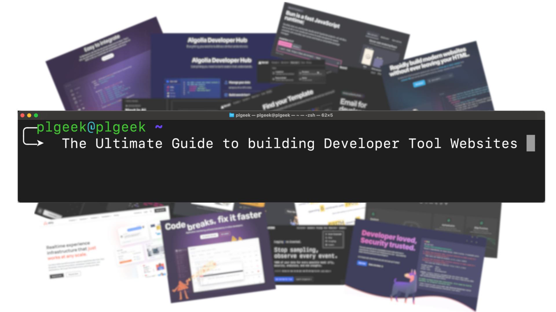
The Ultimate Guide to building Developer Tool Websites
With valuable lessons for all PLG companies


Today’s post is a collaboration with Jakub Czakon and covers a subject near and dear to my heart. It’s for anyone building dev tool / infrastructure products, but contains many valuable lessons that apply to all PLG companies. It’s absolutely chock-full of examples and is one of my favourite plg.news posts to date.
Jakub is the CMO at Neptune.ai, one of the companies that I advise, and is also the author of the brilliant Developer Markepear newsletter, where he shares advice and insights on all things related to marketing for dev tools.
Of all market segments, developers are at the very top of the list when it comes to their preference to self-serve discover, evaluate - and in many cases purchase - tooling that helps them do their job better.
Way before the term PLG was even coined, devs naturally turned to open source software - not just for the ability to see, understand, modify, and licence permitting use it - but also because of the frictionless way they can experience value
Devs don’t want to sit through a demo. They’d rather hop onto a busy road than onto a quick call.
They want to play with things, explore, take GitHub repos for a spin. “Play on a Sunday afternoon and bring it to work on Monday morning” is a dream of any dev marketing program.
But how do you make that happen? How do you hook devs on that Sunday afternoon when they land on your website?
In this post we’ll share 10 steps to get it right and build developer tool websites that work.
Adopt a developer-first mindset and culture
Focus your homepage on the developer
Make docs prominent
Use social proof from real devs
Use an install command CTA
Offer a playground, sandbox, or product tour
Create a template/code sample library
Add an integrations section with code snippets
Value before paywall - let devs test
Make it playful!
To go deeper into each of these we’ve assembled a boat load of examples from some of the best dev tool websites out there.
Let’s dive in.
1. Adopt a developer-first mindset and culture
There is a common saying in startup circles: “People don’t buy a drill, they buy a quarter-inch hole”.
That may often be true.
But when the person buying a drill is a construction worker it most certainly isn’t.

They do want a drill and a special one at that. They know more about drills, quarter-inch holes, and anything construction-related than you or I ever will. It takes them 20 seconds to realise that I never actually used the drill I am selling. Even if I somehow managed to give them a believable drill pitch, their follow-up question, with five construction jargon words I never heard, has me in tears. And not the good kind.
Devs are just like construction workers in that sense. They build software quarter-inch holes with dev tool drills.
And while we wouldn’t try a “Streamlined solution for 10x more efficient, 5x more reliable, 2x more secure quarter-inch holes” on people who build our homes we somehow think it would work on people who build our apps and websites.
It won’t.
Devs, like other builders, want to:
know what the thing does,
see objective specs (docs),
test it out (free tiers, open-source, public sandboxes),
see how the product feels (code snippets, diagrams),
talk to their peers (community),
do it themselves (self-serve experiences),
know that it works with other tools they already use (integrations),
Devs are builders so you want to enable, educate, and inspire them to build with your tool.
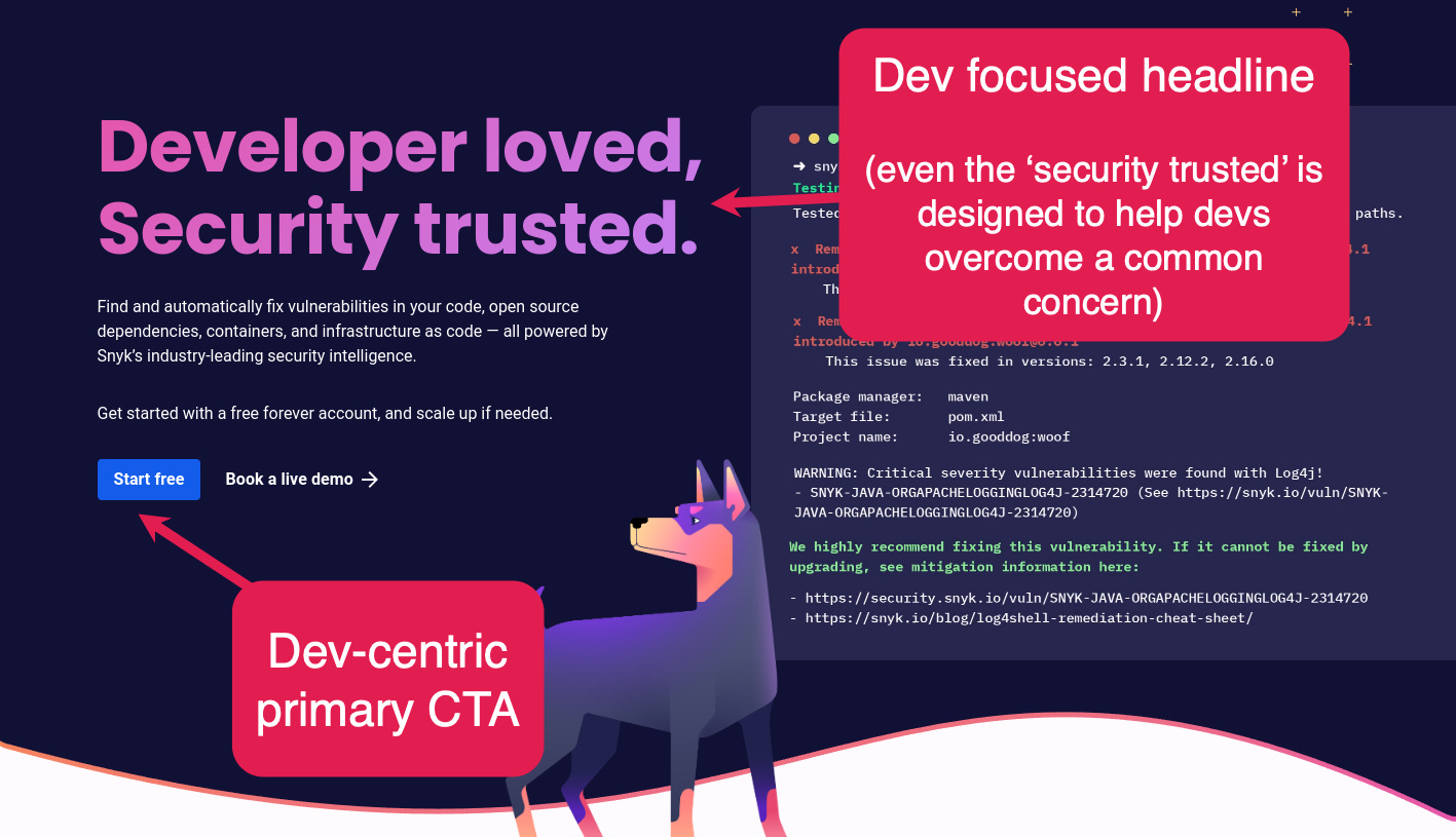
The dev-first mindset should permeate everything you do, across every function in your company. Take Snyk for example.
Snyk was built on the belief that the only way companies can effectively secure the software they build is by taking a developer-first approach. And for Snyk, being developer-first was something that reached far beyond just being developer-friendly, which is table-stakes these days.
Dev-first extended to the heart of how Snyk thought about making developers successful. So everything was looked at through this lens of developer success as problems were prioritised and solved. This included serving non-dev personas (e.g. app-sec) in a way that meets their needs by helping them empower developers to be successful.
When it comes to dev tool websites, it’s important to think about how you can convey any additional messaging to non-dev personas through this lens of developer empowerment. But start by getting the dev messaging right.
Which leads nicely to…
2. Focus your homepage on the developer
In PLG, you need to view, build and leverage your homepage as an early step in the end user journey. Not something that comes before users get started with your product, but as an integral part of the product experience.
For dev tools, focus your homepage messaging on your developer user (and hopefully champion).
Help them adopt. Don’t try to persuade them to buy.
“But the CTO is the buyer, we should talk to them on the homepage”
There is truth that addressing the buyer (typically a CTO or head of engineering) is also important. But the idea of the homepage being the place to do that is generally false. This is especially true for early and mid stage dev tool companies. Later stage companies can lean on their brand (and recognition within developer communities) more heavily, allowing more latitude for homepage messaging to target buyers and their typical objections.
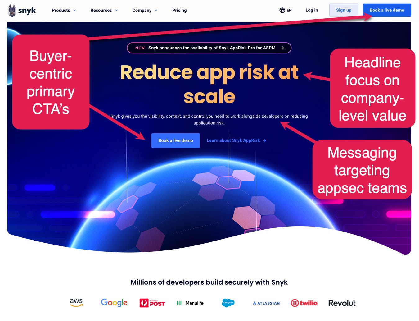
You can see this with Snyk’s homepage design evolution, where the latest design signals a clear shift to enterprise buyer messaging:
Earlier dev-focused homepage:
Current buyer-focused homepage:
For most dev tool companies though, focusing the homepage on the developer is important because:
Traffic distribution biases to devs: The vast majority of the traffic on your dev homepage is not the buyer persona. It is an individual contributor dev who may become your end user.
CTOs don’t evaluate tools: Most of the time, the CTO appoints someone to run an evaluation. Often this is the same dev who brought the problem/solution to them.
Other mediums are more effective for buyer messaging: When convincing buyer personas (not end users) to buy, slide decks, ROI-heavy case studies, and sales engagement are often essential anyway.
A dev focused homepage doesn’t preclude other buyer-centric website surfaces: It’s normal (and expected) to provide dedicated website surfaces that help communicate company value and aim to overcome typical buyer and organisational objections. Think about trust portals, case studies and so on.
If your homepage doesn’t effectively communicate to developers then any bottom-up adoption will be dead in the water.
The goal of your dev tool homepage is to communicate the value of your product well enough to get them to take the next step. For most dev tools that’s signing up to experience value first hand. Ideally you will create champions within your developer user base, and those champions will do a lot of the heavy lifting to sell to the CTO.
Note: We’re using CTO (or other most senior engineering leader) here as the most common buyer that dev tool companies will encounter, but in some cases buyers can be outside of the engineering org altogether, as is the case with Snyk, where the buyer in larger companies was typically the person who headed up the security function e.g. CISO.

Traffic distribution
Who visits your homepage?
The question is hard to answer directly, but indirectly you know that…
If 90% of the traffic to your site comes from the super technical blog you run, it is likely that those are devs.
If your devrel team interacts with dev communities on Slack and Discord, a lot of the direct traffic will be coming from there. Again devs.
If all you do is answer questions and solve devs' issues on your public GitHub repo, you guessed it, the traffic you get (direct or not) will be devs.
There may be situations where that traffic will not be primarily devs. For example at an early stage, your primary GTM motion might be running outbound to CTOs at ICP companies. In that case, your direct homepage traffic will likely be CTOs.
Be honest. Where do people come from and, by extension, who are they?
CTOs don’t evaluate tools
When a company adopts a new dev tool, it typically happens in one of two ways:
The need comes bottom-up from devs: Devs are experiencing some pain and want to find a solution.
The need comes top-down: The CTO/CISO has a mandate to solve some company level problem (typically cost, efficiency, security related).
In the first scenario, devs are likely already evaluating through a trial, free plan, or open source version. And in the second scenario the CTO is similarly unlikely to be running any evaluation process. If it’s a tool used by developers, any CTO or engineering leader worth their salt is going to have developers evaluate and recommend a path forward, or they risk revolt.
Think about it, imagine CTOs running around and picking tools for developers. Two or three layers below in the org structure.Healthy? Empowering? Nope!
“But they are making the final decision so you need to address them”
True but
They will be heavily influenced by their developers (hence dev success, support and evangelism becomes critical), and
There are more effective ways to communicate with (and sell to) these buyers - read on…
Other communication mediums are more effective for buyer messaging
There’s no getting away from the fact that for wider adoption, you have to communicate company-level value to buyers to get them to buy.
But for deals of a given size for business unit or company-wide adoption, your website (and even your product itself) is going to be ineffective alone in convincing buyers.
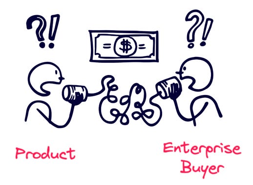
You will almost always need a tailored narrative (ideally supported by product usage data) delivered in high-bandwidth human to human conversation. Product-Led sales leverages this to connect the value developers are realising within a company with the wider value to the company, and wrap that in messaging tailored to the buyer.
If you’re working your bottom-up motion effectively then the champions you’ve developed amongst the developer user base will be an integral part of this process, helping you educate and convince from the inside, leveraging one pagers, case studies, and all that good stuff to get the buyer persona on board.
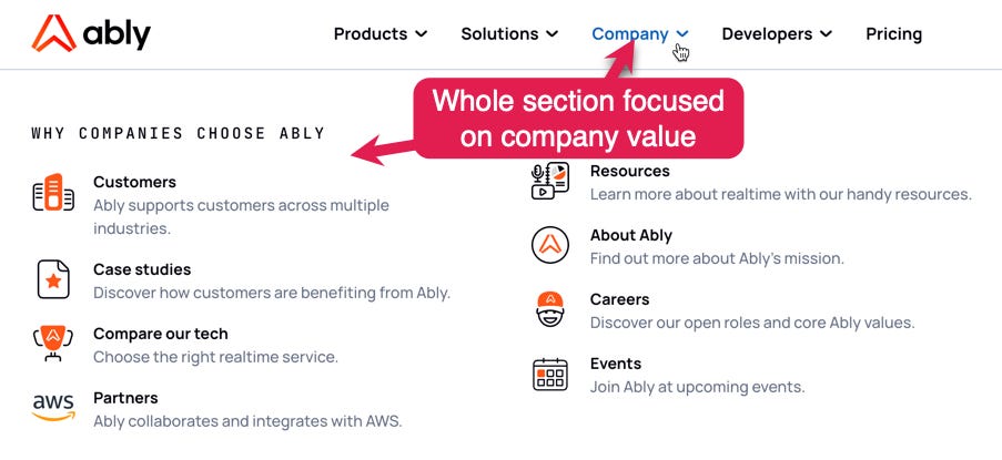
A dev focused homepage doesn’t preclude other buyer-centric website surfaces
You have other website surfaces such as enterprise portals, trust centres, case studies, pricing, about us, and so on that are ideal for buyer messaging.
Ably shows this well:
For most dev tool companies, buyer-focused homepages will alienate developers.
Have your homepage do the essential early work of helping devs quickly understand the value you provide and delegate buyer messaging to supporting areas of the site.
What does this all mean in practice?
Look no further than Supabase to find a gold standard example:
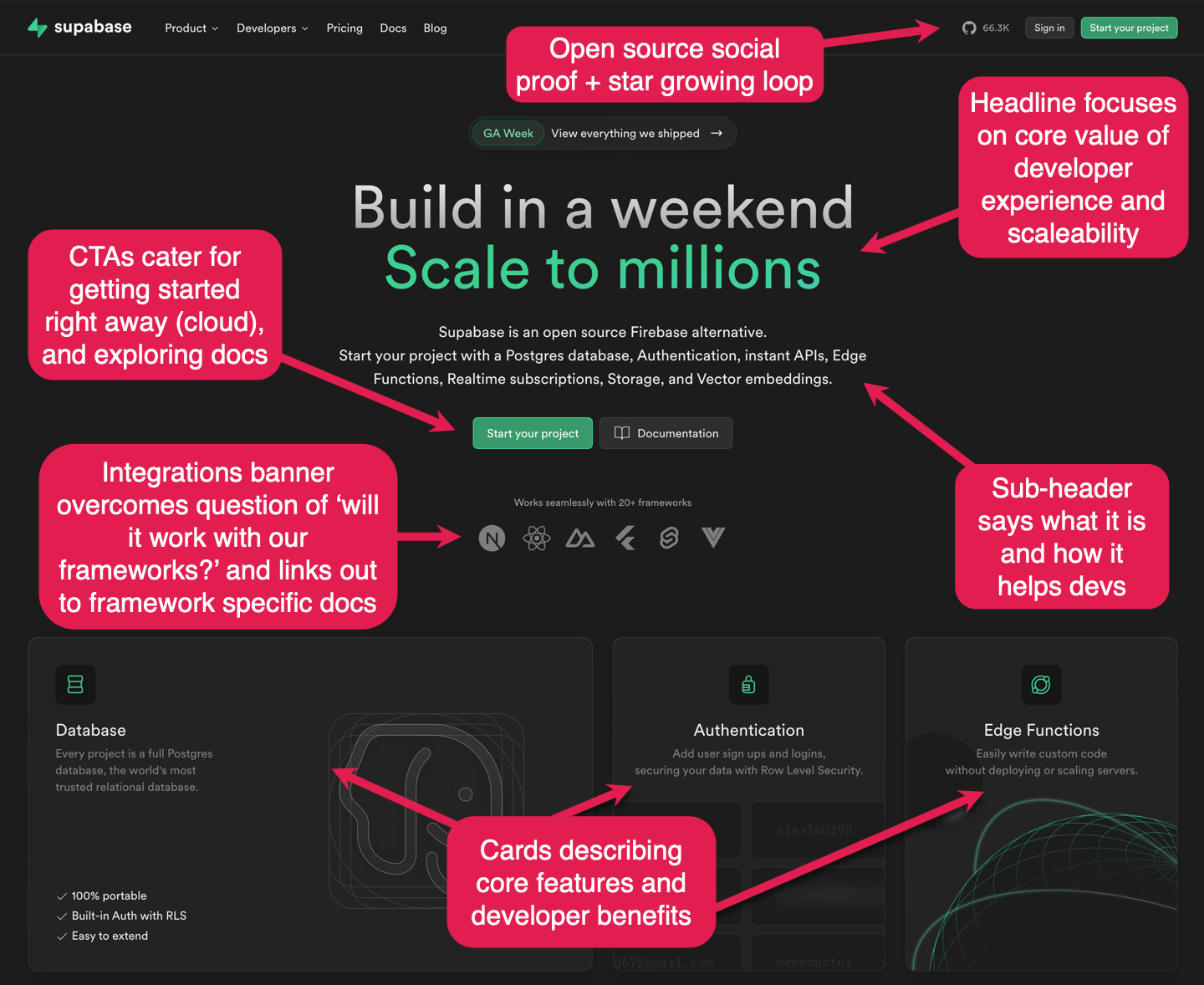
Headers should deliver your core product message and get developers interested. That is true at any stage but is much more important in earlier stage products that are not widely known.
You want everyone, even those folks who just take a look and leave to remember you and your product. You want them to recall it in their next conversation around this topic. You want them to tell others about you.
There may be supporting messages for sure but there is always that one core thing. Make sure it lands.
In the case of Supabase, that core message is that they are a database supporting scale with great developer experience. They have a deep understanding of the developers' context. They know that a huge number of wildly successful products started as weekend passion projects, and they lean into that with this headline.
Their supporting messages are:
You can use the product as an alternative to the now Google owned Firebase.
It’s open source, so you can self-host and run locally, with no vendor lock-in.
It offers an easy way to start building quickly with scaffolding and core functionality taken care of.
And they deliver that beautifully with:
Headline: Clear as day two part headline speaking to value delivered at a level that builds rapport with their audience. “Build in a weekend” says Supabase makes things easy for devs, and “Scale to millions” assures devs their Supabase apps will perform at scale. They also subtly acknowledge that big software projects often start as weekend side projects.
Subhead: supports the core message by describing how devs can start building with the heavy lifting of database, auth, APIs, edge functions, realtime subscriptions and vector embeds all taken care of. Also establishes developer trust and confidence by emphasising it’s open source nature.
Calls to action: These CTAs make the audience feel at home. “Start your project” personalises the desired action. And there’s a link to docs for those who still want to explore further before taking the next step.
Frameworks: Provides quick validation that Supabase is ready to work with over 20 frameworks, and highlights the most common / popular frameworks used by developers. Each links out to the relevant docs page so developers can explore how they’d work with Supabase.
Feature cards: Covering the primary features, benefits and use cases to let the visiting developer know “we have you covered.”
Social proof: Social proof in the navbar, over 66k stars and a GitHub icon. And a way to get people to that repository, check it out and leave a star. The GitHub icon and stars make it immediately clear that this is a project that other developers care about. More stars fuel the word-of-mouth loop around the project, as well as a project discovery loop on GitHub.
Brilliantly simple, and simply brilliant. ❤️
3. Make docs prominent
One of the most common developer journeys on your website is home -> docs -> signup.
A big part of the reason is that docs are more trustworthy, high-fidelity descriptions of your product.
Docs will tell you what it is and what it does. They show you how the SDK feels, show you what the product actually integrates with, and how.
Devs want to have confidence that a product they are signing up for will meet their needs, and the needs of their team, and docs are often how they seek to build that confidence.
They feel at home there. No BS.
If your audience prefers a certain way of consuming information you give it to them. You make it easy to find. You make it prominent. And for devs that’s docs.
But how should you feature your docs prominently?
One of the most tried and tested approaches is to have docs links in the navbar and as a secondary call to action in the hero section.
Developer-focused email-sending provider Resend does just that.
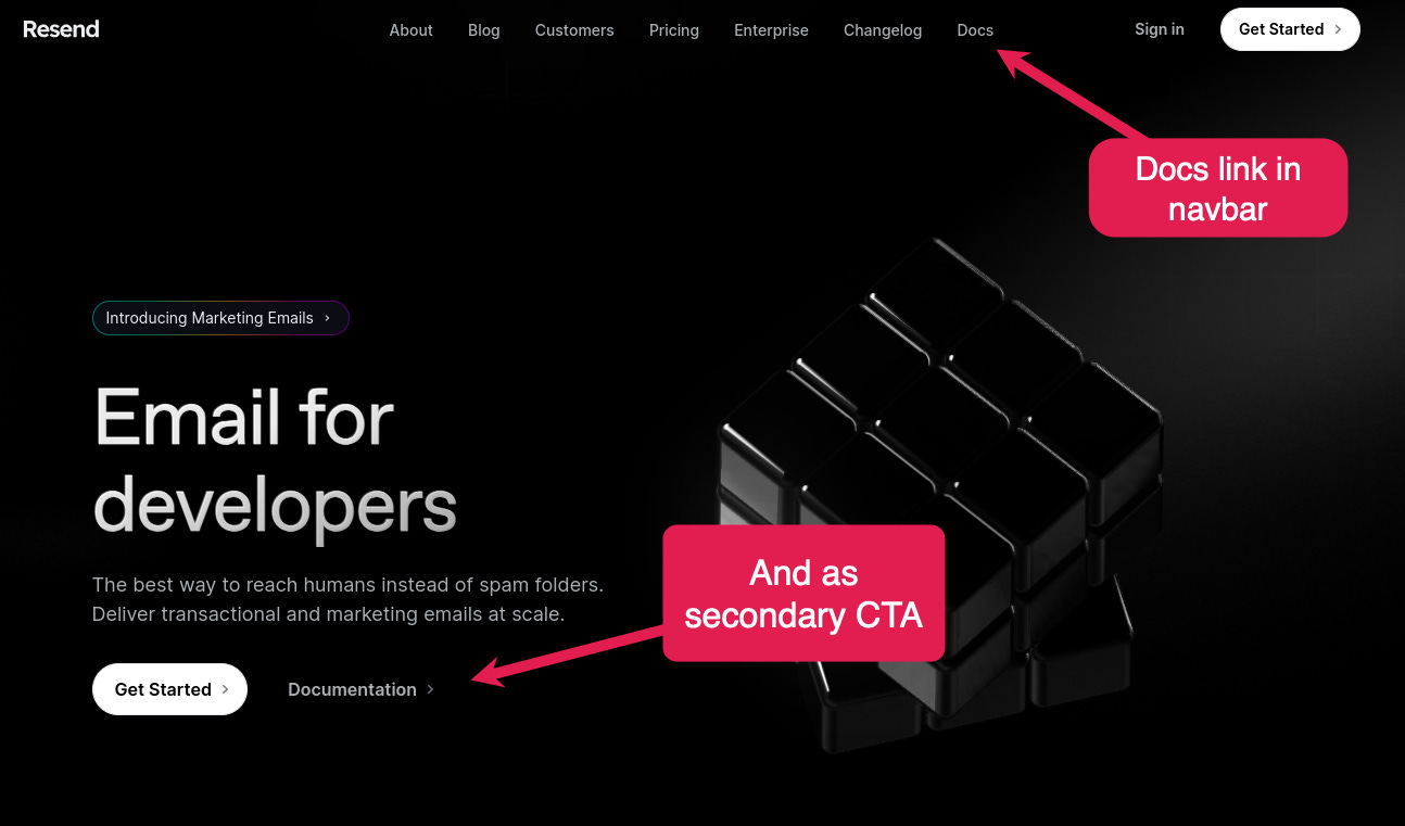
Having Docs as a secondary call to action in the hero (next to “Sign up”, “Get started”, “Start building”) is good practice. If devs understand a gist of what you do but need more confidence in signing up, they'll likely want to see the docs.
Even if devs don’t click on the CTA, having it there still signals that your product is built with that dev-first approach.
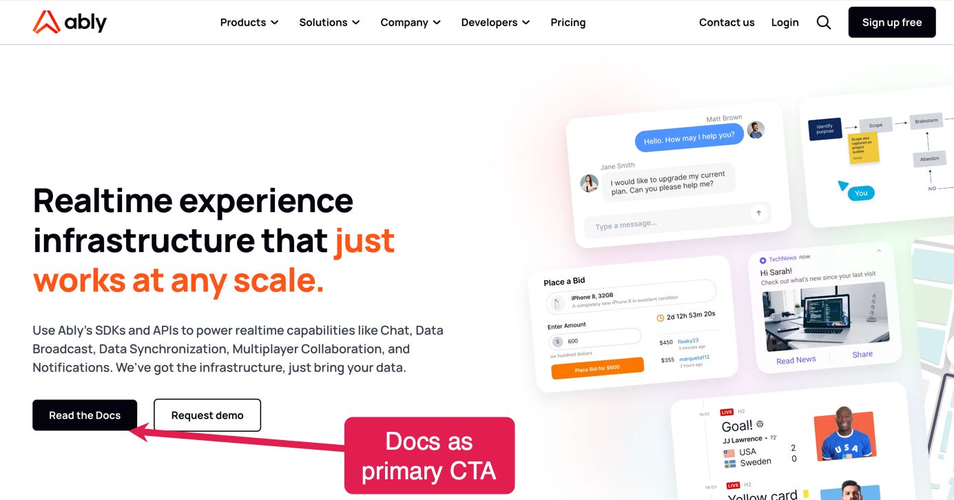
And whilst a secondary docs CTA is a sane default, you can take it a step further, as Ably have done, by making ‘Read the Docs’ the primary CTA.
Or go even further, like TailwindCSS, by providing the means to quickly search and find specific docs content right from the homepage with a search box embedded in the header:
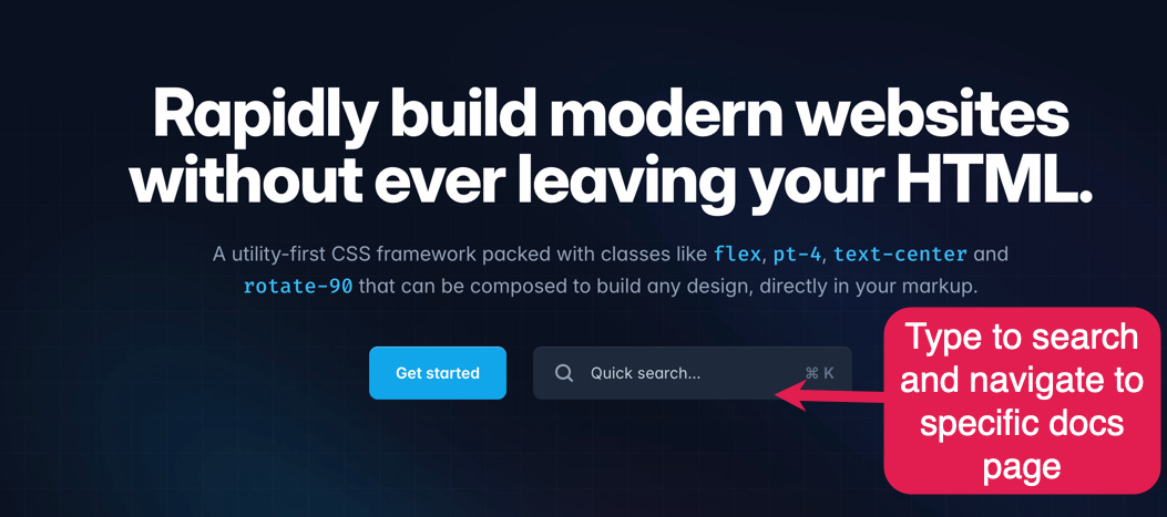
It takes devs directly to the page they are interested in rather than them needing to click around.
They could have searched the docs from within the docs, of course. But this is just the slightly more delightful developer experience that TailwindCSS is known for. Removing a potentially unnecessary step in the developer journey.
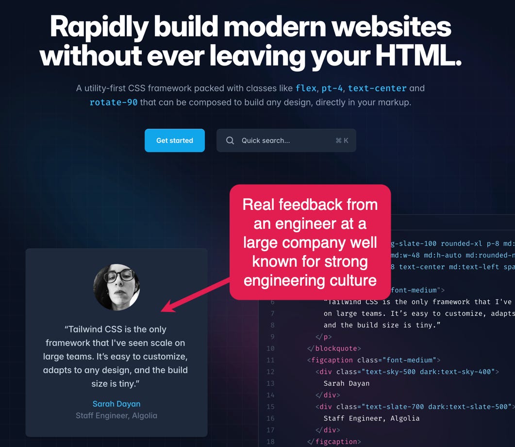
4. Use social proof from real devs
Most companies include some form of social proof on their homepages.
Most often this is in the form of company logos:

The best dev tool websites go further than this and lean into the fact that devs place high value on peer feedback from other developers (that’s why word of mouth is such an important growth loop for dev tools). Ideally that feedback would be from a dev they know, but that’s typically not possible. Regardless, including real feedback from the developer community is a far more effective form of social proof than just including a customer logo.
We’ll use TailwindCSS as an example here again:
And they reinforce this below the fold:

Codeium is another great example here.
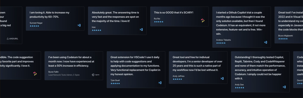
Both examples also lean into the sheer volume of positive sentiment from other devs to help build trust and credibility. Having so many points of feedback also increases the likelihood of one or more of them describing a use case or benefit that resonates with the dev viewing the homepage.
5. Use an install command CTA
Many companies go with some flavour of a “Start building” primary CTA in the hero section that leads to signup.
Some companies, especially commercial open-source ones, figured, why tell devs to “sign up” or even “Install now” when you can give them install commands right there?
One of the earliest companies doing this was Cypress.io.
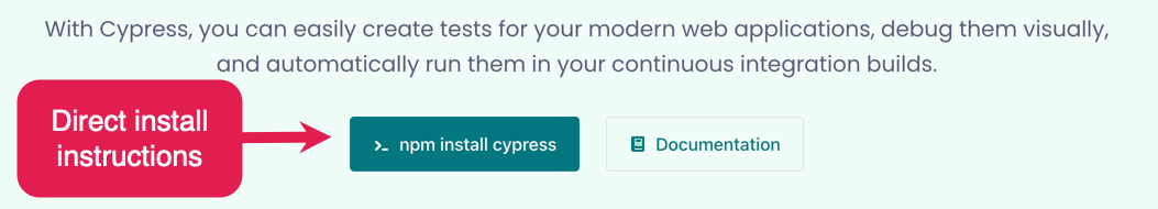
That is perhaps the epitome of a developer-focused CTA. You go straight for the install/download.
If using an install command as one of the CTAs is an option for your product, it sets the tone for the entire homepage. That install command as a primary CTA makes it obvious this page is focused on the developer.
But more importantly, it communicates how easy it is to get started. And communicates it in the language of the developer audience - code.
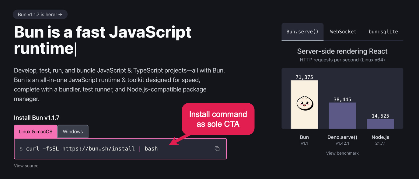
If you’re a non-commercial / open source project you can go even further, like Bun have done, making the install command your only CTA.
6. Offer a playground, sandbox, or product tour
What if getting started now is not really that valuable for your end user?
Especially in dev infrastructure like observability or databases it may be unrealistic (and counter-productive) to expect them to start right now. And if they don’t experience some value in that first session the risk of them leaving with a bad taste of your brand is higher.
So what do you do?
You give them a realistic sample. That could be a Sandbox, Test environment, Product tour, or interactive embedded experience. You get them to experience value without having to integrate or migrate from whatever they are using now.
With platform / infrastructure tools, it is notoriously difficult to show people the value quickly.
To really see it they would need to set up everything at their company infra, create dashboards for their use case, and so on.
A lot of work.
That is why creating a sandbox experience is a good way of giving people a taste.
Let them experience some value quickly, even if it isn’t in their own environment.
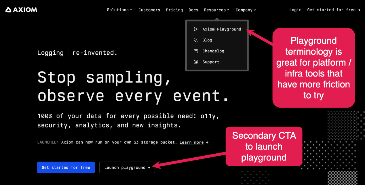
Axiom calls their sandbox a playground and uses the "Launch playground" terminology.
This copy is effective because:
they acknowledge it isn't a real thing (but a playground)
it conveys that it will be interactive and you'll be able to click around
it makes it feel like less work and more, well play :)
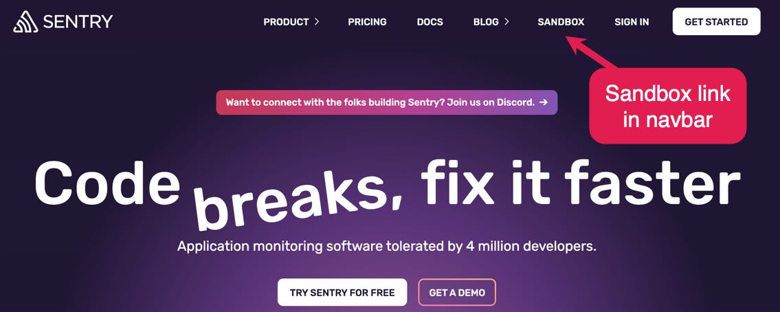
You can make it even more prominent and put it in the navbar, as Sentry have done:
But how do you make these sandbox experiences work for the dev audience?
How do you deal with:
Explaining your complex dev tool value proposition quickly
Showing both code and UI elements
Making devs feel great developer experience of your product
Driving devs to the conversion action without being too pushy
?
And how do you do all that without overwhelming them?
That is hard.
But Vercel’s interactive demo does it well:
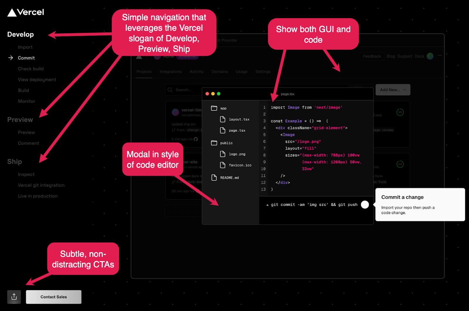
What’s great about it:
Clean navigation that lets you go back if you want to
They use their slogan "Develop, Preview, Ship" to reinforce the product message
They show both code and the UI
The CTAs are visible but subtle enough not to distract
They guide you through a use case, not a bunch of features
What they show is as simple as possible but not simpler
A job well done, Vercel. 👏
7. Create a template/code samples library
On the other side of the coin, if it’s possible to build something with your tool relatively quickly (especially if you can see the result of it), then templates and code samples are a great tactic.
You want to jumpstart those devs with a ready-to-go example.
You show the live result, you give people code and a clear instruction on how to tinker.
And wait for the magic to happen.
Again, Vercel provides a great blueprint:
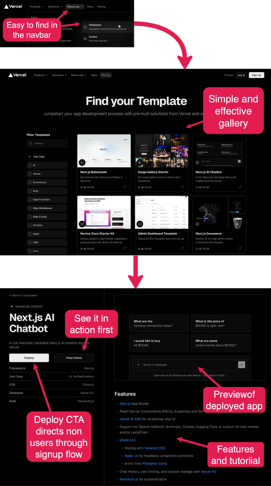
They start with an easy-to-find CTA in the navbar resources section. Bonus points for adding one-liner descriptions that make it clear what is on the other side of the click.
On the templates library page, they give you solid use case navigation with tags. And each template tile has a result thumbnail and a short description. The beauty of this is in the simplicity and what they didn't put in here.
Each template page shows the result, gives you a tutorial on how to use this, and clear CTAs to either see this live or deploy yourself. The "Deploy" action copy is a great outcome oriented CTA (instead of "Sign up").
This is just a great touchpoint in the developer journey.
For more inspiration, check out the Algolia code exchange.
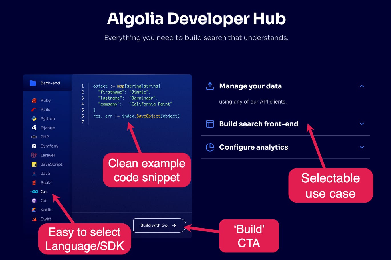
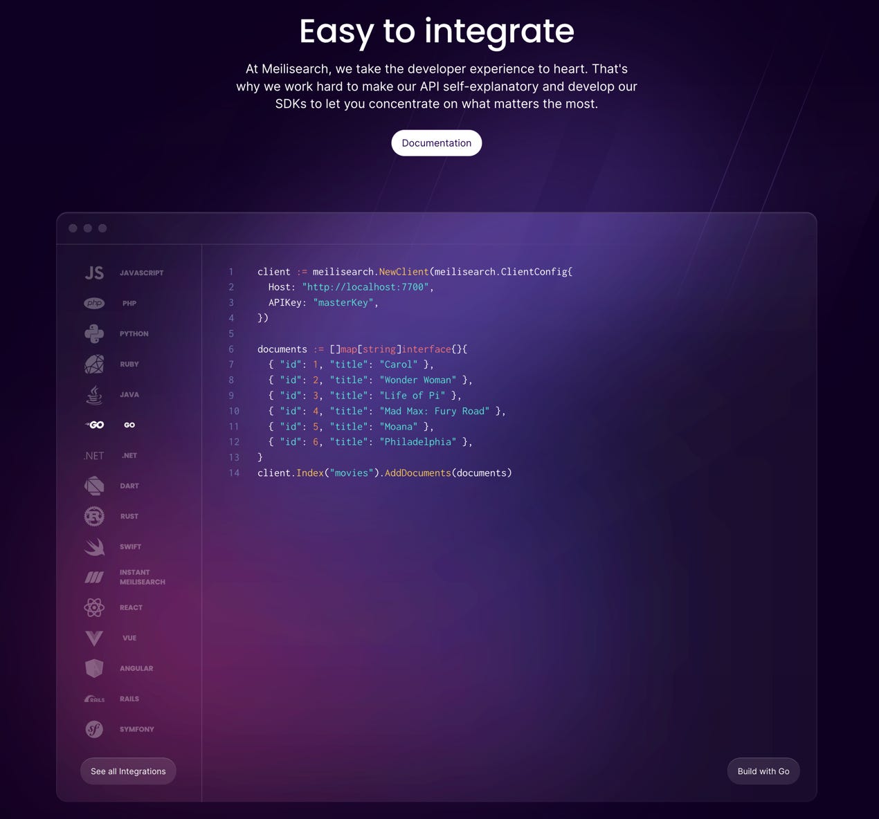
8. Add an integrations section with code snippets
OK, so you’ve got your developer visitor interested in using your dev tool.
They need to know that it works with their current tool/tech stack.
Many companies just show a bunch of framework/library/cloud vendor logos and call it a day.
Some go the extra mile and use this section as a way to show how their product feels.
They show that their SDK is idiomatic and doesn’t feel like a C++ dev writing Python.
And when you spark interest you just present devs with the obvious next step which is:
Copy button so that people can copy-paste the code snippet and start tinkering
Start building CTA that leads to the particular integration docs page
See all integrations (as you typically only show the most popular integrations in one section)
Algolia has it in their developer hub:
A more typical way of placing that element is lower on the homepage. Meilisearch is a good example:
9. Value before paywall - let devs test
Devs like free.
Not because they’re cheap, but because they want to try before they buy.
They want to see if the value you promised on the “marketing website” is true.
And since they know “they could build it themselves” the bar for the value they want to experience is high.
Ideally, developers want to adopt the product at work before they have to talk to the “higher ups” and sell it internally. And if you ever worked at an enterprise or sold to one, you know getting new software in there takes time.
That is a big reason why devs would much rather use the open-source version, or a free version without talking to anyone internally for as long as they can (sometimes never).
They will want to “shadow IT” it.
If their team starts hitting the limits of the free plan they will see if the team lead could pay as they go with a credit card.
If that is not an option either they will reach out to sales. They will want you to help them sell it internally by that point.
All that is to say that if the only option to use your dev tool at work is to talk to sales, you are likely in trouble.
You will not be selling that dev tool bottom-up through the developer audience if there is no option for them to test it for free.
So make it obvious that they can use it for free in some capacity.
It’s PLG 101 - Value before paywall.
But how do you show it though?
CircleCI highlights their free plan.
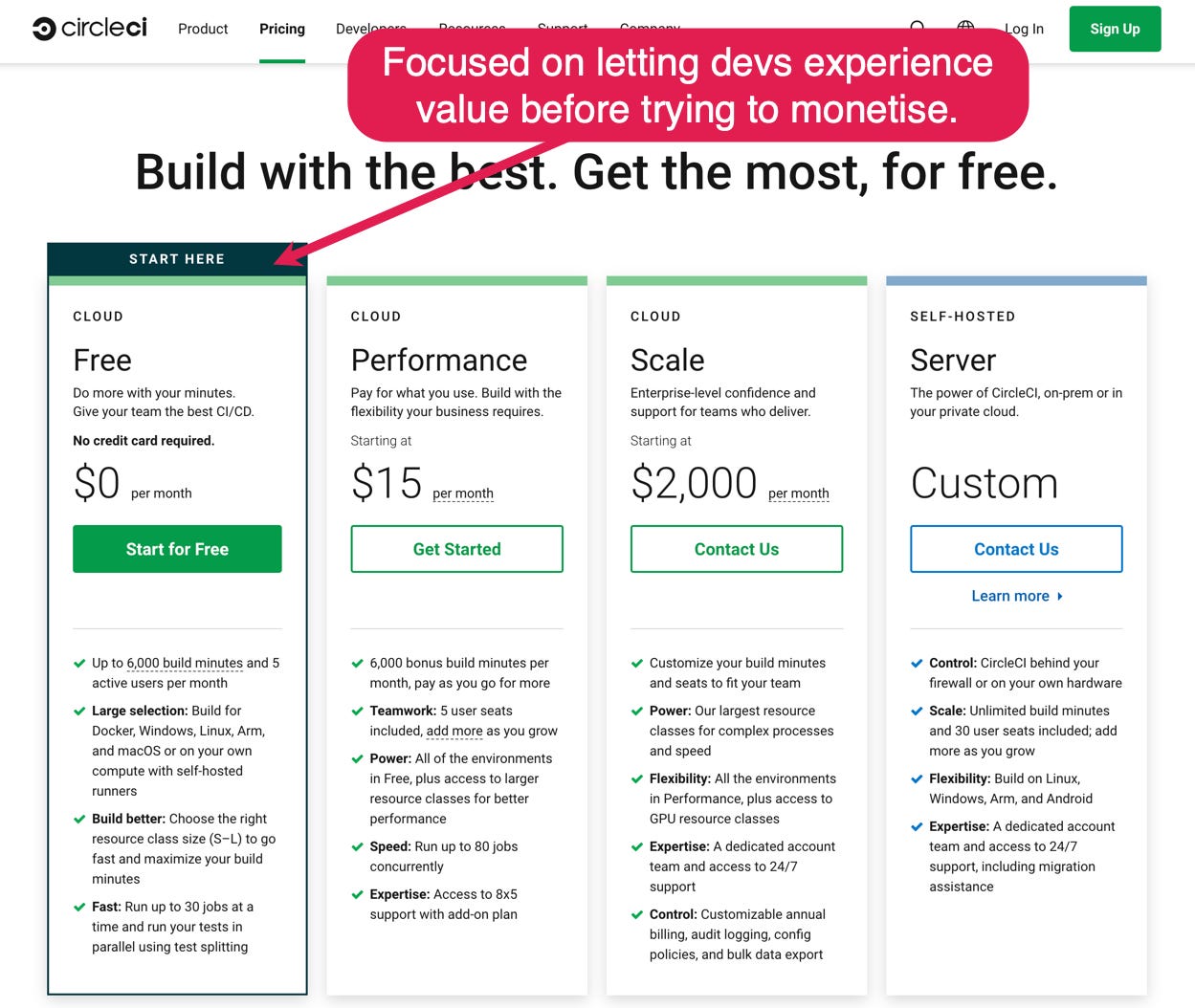
Most companies highlight a middle tier paid plan saying something about it being "most popular".
Sure it may be your most popular plan. But most developers will not convert to your paid plans right away.
So why not try and capture as many devs as possible on the free plan?
If they like your dev tool there are many things you can do to convert some of them to paid plans. But if they leave that pricing page and go with some other free tool, you are not converting anyone.
CircleCI highlights free and they are in the mature, competitive market of CICD tools.
They understand that to get a company to pay for their product, they need to take the developer and their team on a journey that starts with the dev experiencing value.
10. Make it playful
In some cases you may be able to lean in to an opportunity to have a bit of fun with your homepage in ways that will resonate with your developer audience.
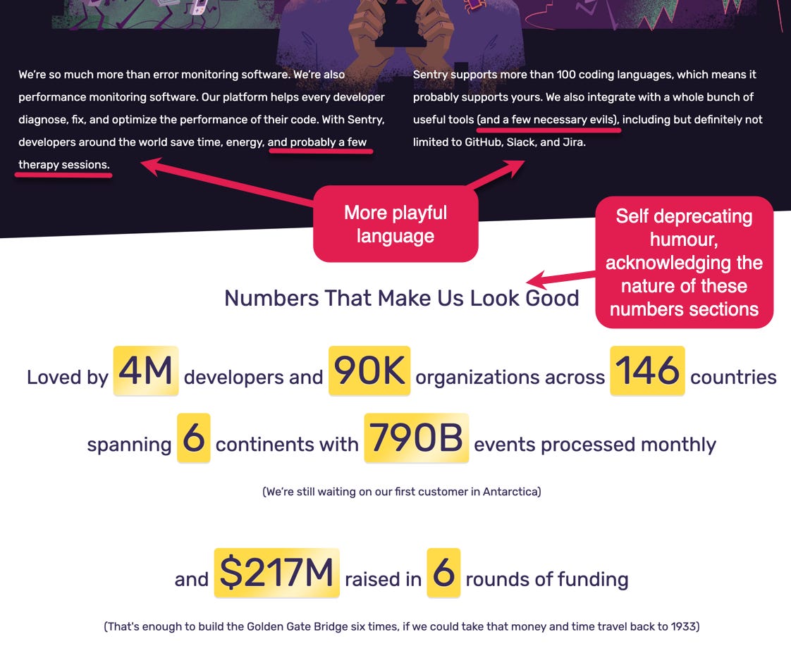
Sentry does this brilliantly:
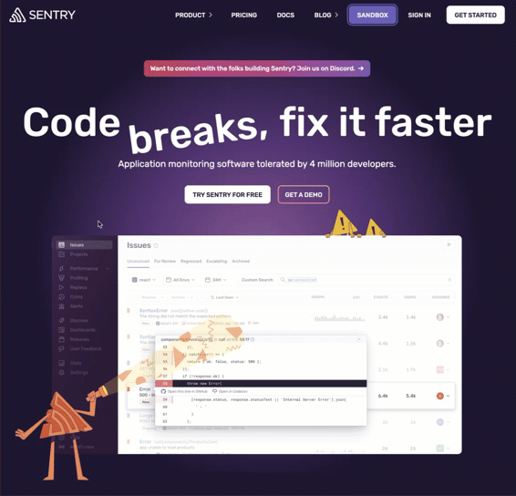
The interactive ‘breaks’ animation is quirky but also conveys the ease and speed of fixing that Sentry promises.
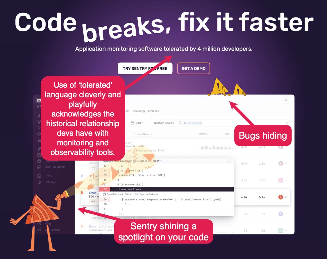
And this playfulness continues across the rest of the homepage and the wider site.
It’s absolutely one of the most memorable sites a developer will visit. In a very good way!
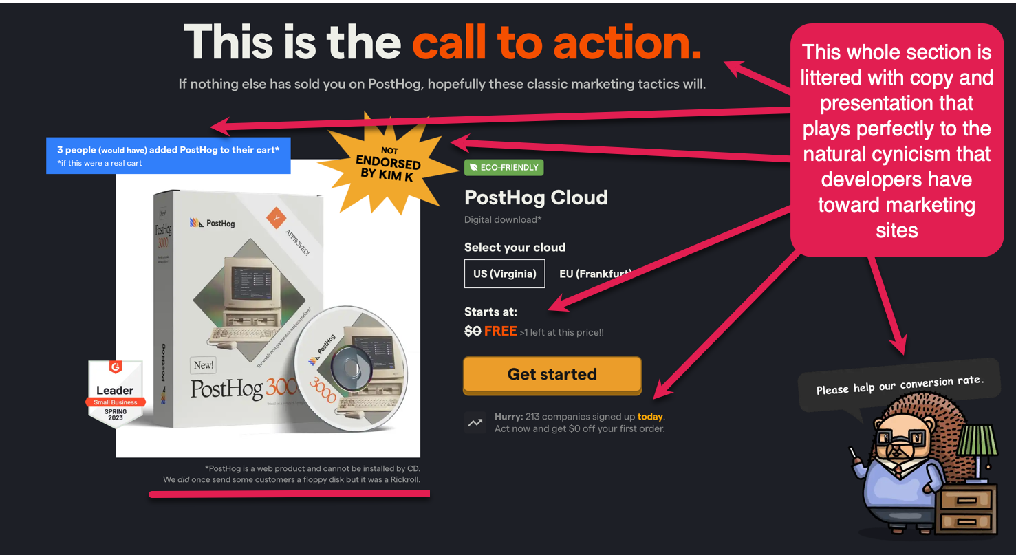
Posthog also leans in to humour to great effect:
Conclusion
Here you have it. The ultimate guide to building dev tool websites.
To recap:
Adopt a developer-first mindset and culture
Focus your homepage on the developer
Make docs prominent
Use social proof from real devs
Use an install command CTA
Offer a playground, sandbox, or product tour
Create a template/code sample library
Add an integrations section with code snippets
Value before paywall - let devs test
Make it playful!
But if there is just one thing you take away from all this, it should be to focus on the developer. They will bring your product to their wider organisation.
Avoid at all costs your website giving off a vibe that shouts “go away developer”.
If your header copy says “Embrace the future”, and there are happy executive faces and core company values splattered left, right and centre, then you’re almost certainly doing it wrong.
For dev tool websites, the buyer is of secondary importance.
You’ll need to convince them eventually, but having a foot in the door via demonstrated value amongst a passionately supporting developer user base will make that convincing much more straightforward.
Get devs on board first. It’s the essential prerequisite.
Apply the dev-first mindset judiciously to all of this guidance, and we guarantee you’ll find ways to improve your dev tool homepage.
And even if you’re working on PLG products targeting non-developer users, many of the lessons and tips here are transferrable.
Step into the shoes of your user, and go from there.
Until next time!
This post was presented by Zeda.io, and by Sidebar.
PS: For additional reading, check out the library of developer marketing examples that Jakub has curated on his site.
This comprehensive guide offers fantastic tips and examples for creating effective developer tool websites that provide value and resonate with tech audiences.
This is awesome! What a great summary of early adopters behaviours and psychology ✌️ well done!